woensdag 11 september 2013

Designer Spotlight Highlights

Hi everyone! Only 4 days left to enjoy my birthday sale. My entire shop is 40% off (exlcuding collaborations) untill the 15th of September. Go shop here! This also includes my newest Passion for Project 365 Template Set


There are not only 4 days left of my SALE, but also only 4 days left to play my Designer Spotlight Challenge at Oscraps. We're scrapping Altered Portraits, you can find some more inspiration on my pinterest board. To help you get started I've created a FREEBIE. You can find it in the first post of the challenge! 
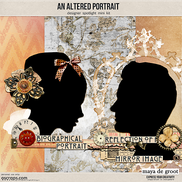
Here's a preview of the designer spotlight freebie:

and here are some layouts created for my designer spotlight 
(wish I could show them all):
by Marleen

By Vicki (oldvwblues)

By Ronda (Scrappingramma)

By Eszter (beszteri) 

By Jean (scrapgenie)
  
by Diane (dwsewbiz)

by Diane (madi)

Hugs, Maya


zaterdag 7 september 2013

How do they do it

How do they do it?
 
I just love that show on Discovery Channel, seeing how things are made.
And now, Diane is going to show us here how she made her layout for my spotlight challenge.


Hi everyone,
Diane here,
I was asked how I made my layout for Maya's challenge, and writing down what I did, is not easy so I made some screenshots to show you all.
It may not be the best way to do it, or the correct way to use my Photoshop, but it is just how I did it.
 
First of all I opened a new canvas, 3600 x 3600 pixels and chose my picture I wanted to scrap.
 
 
second step: duplicate the picture
and create a layermask (choose option threshold).
 
Play with the slider until you get a picture with lots of black.
Next step: merge the layermask and the duplicated picture.
 
 
Now you have 2 layers,
your picture and the black and white version of your picture.
 
 
For the next step I duplicated the black and white layer,
selected the white with the magic wand
and deleted the white parts.
 
 
Now you have 3 layers,
your picture,
the back and white version
and a black clipping mask.
 
Now you can add a paper and clip it to your mask.
(option is playing with the blending modes,
I tried darker / lighter / colour burn
and decide what you  like best)
 
 
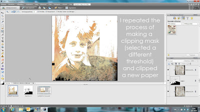
I repeated the process of making a clipping mask.
Just select a different threshold (less black)
and clipped the next paper,
and played with the blending modes again.
 
 Make sure you unselect the black and white version (or delete)
 
and create another clipping mask and clip your paper.
 
repeat the process of making clipping masks and clipping paper as much as
you want.
 
This is the final clipping mask, here i did not clip a paper to it,
so the black gave some extra accents to my picture.
 
 
I was happy with my result of the picture,
so I added some brushes to embellish the layout.
 
and finished with adding some elements.
 
 
There may be better or easier ways to create this effect,
but I just played around and ended up with this layout and
 I am very happy with the result.
 
Hope this is clear enough,
if not, do not hesitate to ask questions
here or at Oscraps!


woensdag 4 september 2013

Sale, Anniversary and Designer Spotlight


Hi everyone! It's my Designers Spotlight at Oscraps and
I have a challenge for you.
 
You are all invited to play along here at Oscraps!
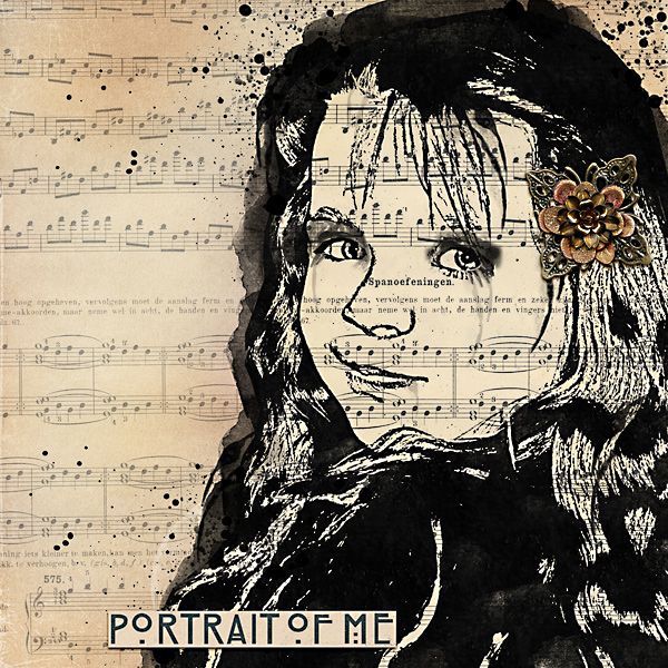
 
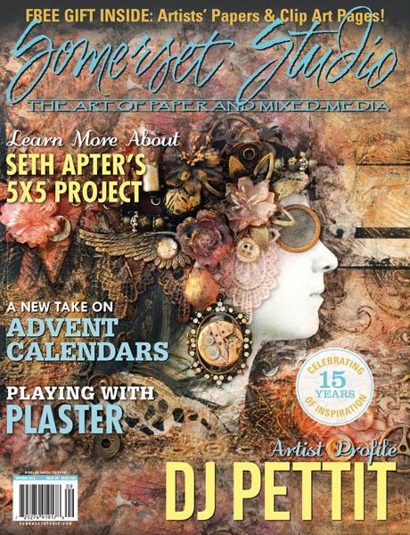
Last year I got a copy of Somerset Studio Mixed Media and on
the cover I saw this amazing piece of art. A mixed media
(and to me a bit steam punk style) self-portrait.


I knew someday I wanted to do this and thought
it would be an awesome challenge. But I wanted to use it for
something special, so now (almost a year later) here it is.


My challenge for you is to create an Altered Portrait. Although
my new kit and coordinating spotlight freebie are steampunk inspired,
this will not be an requirement (but you’re more than encouraged
to try the steampunk style). I would love for you to choose a
picture of yourself or a familymember (en profile or en face are the
easiest to work with), but you can also take a picture of your pet or
even use one of the silhouettes from the freebie (or the kit). The idea
is that you take this picture and alter it up, give yourself
a digi make over. Always wanted to have flowers as hair? Now is the time
to do it! Want to know how your face would look like if it was
made from papersnippets? Come and play!
Anything is possible as long as your portrait is Altered in some way.
To give you some ideas of what directions are possible
I’ve created a board on Pinterest: Art:: Altered Portraits


Here's my new kit, I used it for my example layouts
and it's also 40% off!


To help you get started with this challenge I’ve created a freebie.
You can download it by clicking on the preview.


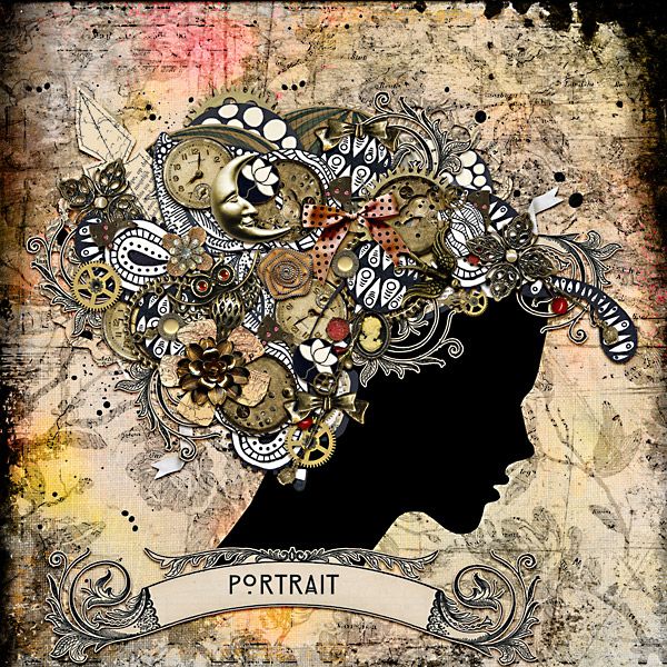
Here are some examples by me


Layout requirements:


Your layout must contain an altered portrait

Use at least one paper/element from the An Altered Portrait freebie (or better yet the coordinating kit which is on sale).

Use 50% Maya de Groot designs and 100% Oscraps products - freebies are okay.

You must post your layout in Maya’s gallery

You must also post your layout in this thread. The cheeryo's will help you if you have difficulty posting your layout here.

You can do as many layouts as you would like as long as you post them in the gallery and this thread.

Al layouts must be uploaded to Maya’s gallery and posted in this thread before September 15 11.59 pm EST
__________________
__________________

dinsdag 3 september 2013

EYCC september

Hi everyone,
 my september  "express your creativity" challenge
is posted at Oscraps!!
 

the september EYCC will be all about songs. Art journaling with songs.
When I started art journaling, I never knew what to journal..so I decided
I'd use lyrics as "my journaling". I like to use a fun sentence and
scrap it, so for this challenge I want you to choose any song and scrap it.
You can use the lyrics, the title, something fun from the musicvideo
or do what I do: listen to the song and try to recreate the song in an image..
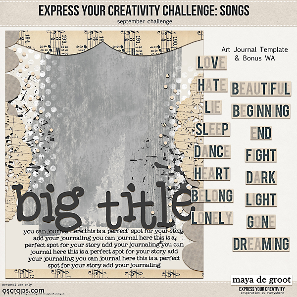
To help you get started I have a free template (Art Journal Size) and some wordstrips


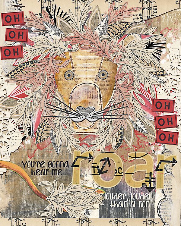
and here's my example. I used Roar by Katy Perry


The Rules


- Please use 50% Maya de Groot designs & 100% Oscraps stuff.
(Dig into your Oscraps stash or check out the freebie category in the store!)
- Post your layout in the Maya de Groot designs gallery.
Don't forget to list your credits ... enable your fellow O-scrappers!
- Come back to this thread and post a link to your image (and the pic
please if you know how) so we can leave you some lovin' in the comments.

Post all layouts by Monday, September 30 2013 (midnight EST-USA)
and check back to see who wins a coupon code to my store!

maandag 2 september 2013

Teen Talk and Social Scrap

Here are three of my latest products:
 
The Social Scrap
Makes posting your pictures online fun and easy
or scrapping your social media pictures easy.

 
Teen Talk, a set of wordstrips/wordart
to match the pictures of your teens.
 
 
And a set of 8 journaling cards,


all these products have a matching style and colour scheme, so they
can easily be used together

Passion for P365 templates

Here are my latest sets of templates,
perfect for P365.
Makes scrapping your weekly pictures so easy!


Product updates, Miss mixed media collection

 Have a look at all my misses!
 
First miss Maya

 
and a coordinating element pack:
 
 
Miss Jodi,  she loves the beach!
perfect for summer pages.
 
 
Next is Miss Justine,
you can find her in the kitchen.
 
 
and the newest Miss,
Miss Augustine
She loves ancient Rome/Italy
 
 
and a set of travel wordart
in coordinating colours