Some pages using my Documenting December 2013 products:
zondag 8 december 2013
donderdag 5 december 2013
Documenting December 2013
I have some new Documenting December products in my
store,
all 31% off!
First:
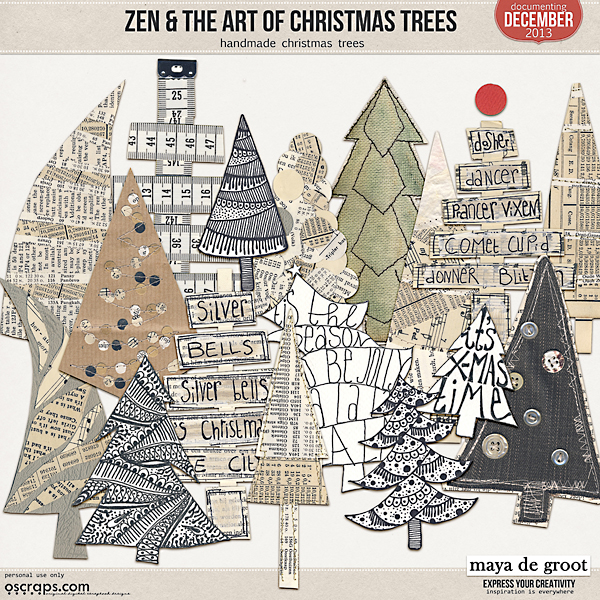
Zen & the Art of: Chirstmas Trees
17 handmade
Christmas trees
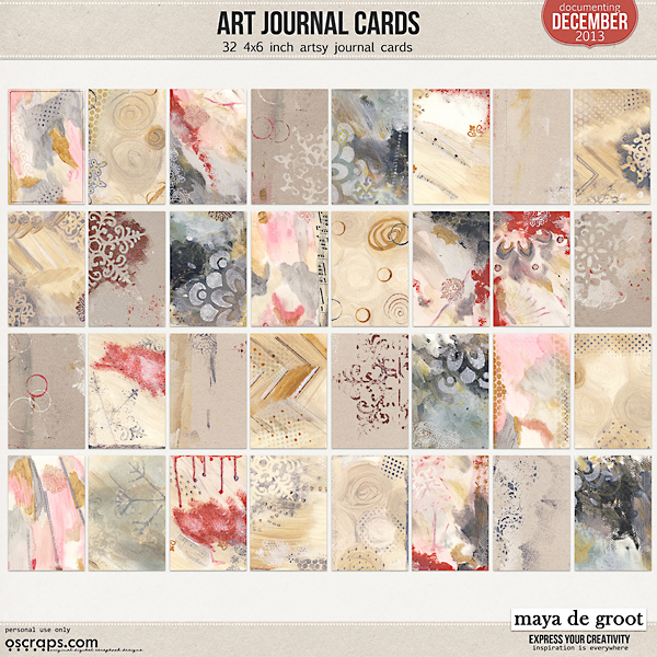
Art Journal Cards,
32 handpainted cards, 4x6
inch
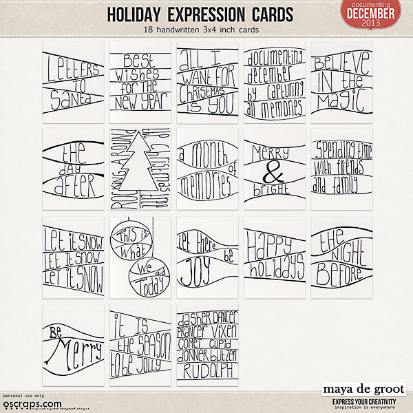
Holiday Expression Cards
18 handwritten cards, 3x4
inch
Artsy Photo Templates
18 photo
templates
Chalk Alphas
2 chalk alphas, all caps, A-Z 0-9
donderdag 14 november 2013
FlipOver Calendar 2014
My 2014 FlipOver Calendar
is now available at Oscraps.
Here are some quick
instructions on how to make a stand for your FlipOver Calendar.
Get your tools
together.
You need:
cardboard, ruler, scissors,
glue, tape, punch and albumrings.
Get your cardboard,
scissors and a ruler
Draw your calendarstand.
You need two rectangular
pieces of cardboard,
Size 10 inches long,
and 4,5 inches wide.
Draw a folding line 2,5
inches from the bottom.
Cut out the 2 pieces of
your stand.
Use a bone folder tool (or
and old icecrream stick) to make the fold line.
Get your printed calendar
and carefully mark the holes and punch them out.
Glue the 2 bottom pieces of
the stand together.
Or staple them together to
make it stronger.
Tape the top side of the stand
together, between to holes
and place the album rings (or use a string or
ribbon).
Hang your calendar, et
voila!
Congrats, you finished your
calendar stand and created your own FlipOver Calendar.
You can always use a
fancier piece of cardboard to create your stand, or decorate/paint it, but for
this tutorial I just (re)used a regular piece of cardboard.
If you want an even fancier
stand, this Calendar fits the IKEA Tolsby Frame perfectly. It sells for 1
dollar/1 euro/1 pound. I live close to IKEA so ofcourse I had to use it.
woensdag 11 september 2013
Designer Spotlight Highlights
Hi everyone! Only 4 days left to enjoy my birthday sale. My entire shop is 40% off (exlcuding collaborations) untill the 15th of September. Go shop here! This also includes my newest Passion for Project 365 Template Set
There are not only 4 days left of my SALE, but also only 4 days left to play my Designer Spotlight Challenge at Oscraps. We're scrapping Altered Portraits, you can find some more inspiration on my pinterest board. To help you get started I've created a FREEBIE. You can find it in the first post of the challenge!
Here's a preview of the designer spotlight freebie:
and here are some layouts created for my designer spotlight
(wish I could show them all):
by Marleen
By Vicki (oldvwblues)
By Ronda (Scrappingramma)
By Eszter (beszteri)
By Jean (scrapgenie)
by Diane (dwsewbiz)
by Diane (madi)
Hugs, Maya
zaterdag 7 september 2013
How do they do it
How do they do it?
I just love that show on Discovery Channel, seeing how things are made.
And now, Diane is going to show us here how she made her layout for my spotlight challenge.
Hi everyone,
Diane here,
I was asked how I made my layout for Maya's challenge, and writing down what I did, is not easy so I made some screenshots to show you all.
It may not be the best way to do it, or the correct way to use my Photoshop, but it is just how I did it.
First of all I opened a new canvas, 3600 x 3600 pixels and chose my picture I wanted to scrap.
second step: duplicate the picture
and create a layermask (choose option threshold).
Play with the slider until you get a picture with lots of black.
Next step: merge the layermask and the duplicated picture.
Now you have 2 layers,
your picture and the black and white version of your picture.
For the next step I duplicated the black and white layer,
selected the white with the magic wand
and deleted the white parts.
Now you have 3 layers,
your picture,
the back and white version
and a black clipping mask.
Now you can add a paper and clip it to your mask.
(option is playing with the blending modes,
I tried darker / lighter / colour burn
and decide what you like best)
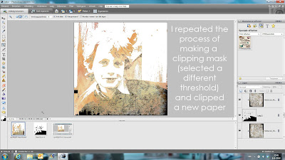
I repeated the process of making a clipping mask.
Just select a different threshold (less black)
and clipped the next paper,
and played with the blending modes again.
Make sure you unselect the black and white version (or delete)
and create another clipping mask and clip your paper.
repeat the process of making clipping masks and clipping paper as much as
you want.
This is the final clipping mask, here i did not clip a paper to it,
so the black gave some extra accents to my picture.
I was happy with my result of the picture,
so I added some brushes to embellish the layout.
and finished with adding some elements.
There may be better or easier ways to create this effect,
but I just played around and ended up with this layout and
I am very happy with the result.
Hope this is clear enough,
if not, do not hesitate to ask questions
here or at Oscraps!
Abonneren op:
Reacties (Atom)


